|
Fashion trends in the 2000s have proven quite eventful. We have lived through colour-blocking, neon clothing, shutter shades, Von Dutch hats, and now it seems we've circled right back to pairing prints.
One thing we’ve learned from all of this is that with every new trend comes a strict set of rules, donned “do’s and don’ts” which are usually followed by an easy-to-read listicle on the best ways to wear it. Pairing prints is no different.
As the age-old saying goes, “money can't buy you style”, but it can buy you prints, which is pretty much the same thing in our eyes. We’re giving you permission to go wild, grab your most colourful and attractive pieces because we’re about to teach you 5 ways to pair your prints like a boss.
|
| 1. Avoid power clashing: try pairing prints with a colour in common |
 |
|
The first rule when it comes to pairing prints is finding a common denominator, or in this case, a common colour in both prints, this creates consistency and flow in your ensemble and will also make your outfit look well-thought-out as opposed to like a “last-minute- get-up”. The next time you try to pair florals with stripes, make sure your pinstripe item matches another element in colour in your florals, be it the leaves, the petals or the background scheme.
|
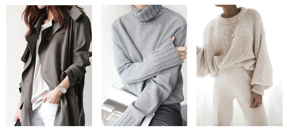
| 2. Pair mixed prints with neutrals |
|
So you love the edge and have graduated to pairing prints, on prints, on prints. That’s completely doable and you could make it look stylish too. All you have to do is make sure you have at least one neutral item when pairing. Try a checkered shirt, with patterned chinos (or printed leggings) topped off with a seasonal trench coat in beige, or black. The neutrals will even-out the look without drawing too much attention to your ensemble. Think; New York City chic, and not “walk-in extra for a kiddies show”.
|
| 3. Invert your colour schemes |
|
Ok, we heard you, the inside of your trench coat is lined with a leopard print silk lining, and you’ve always decided to pair it with black. You’ll be pleased to find out that you don't have to. In fact, pile on the print – as long as you invert the colours that is. That's right if your lining is black spots on a brown background try pairing it with something that has brown spots on a black background. More of a polka dot or check kind of person? Try black squares on a white background for your shirt, and white squares on black background for your bottoms. Got it? good!
|
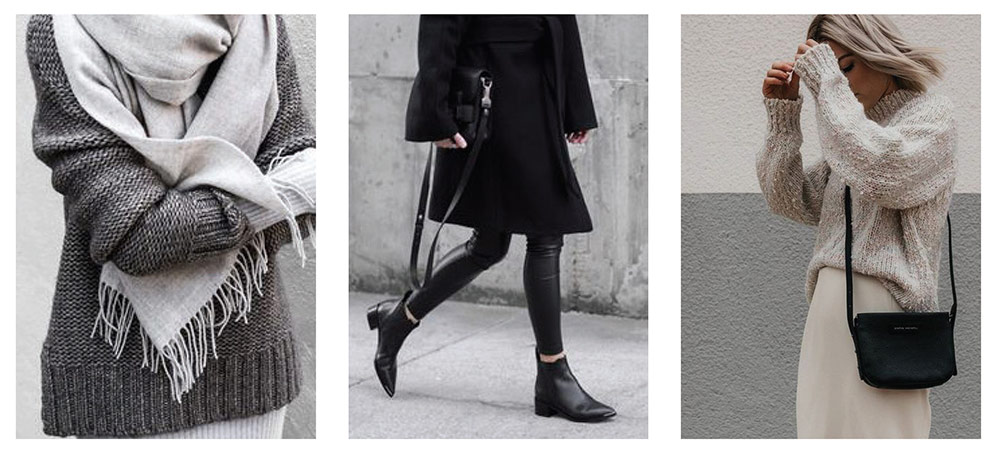
| 4. When in doubt, go monochrome |
 |
|
Monochromatic colours are a good bet on any given day, they fare even better when paired with prints that are similar in design but aren’t identical. If you have a pin-stripped suit, try pairing it with a regimental striped tie. Or opt for striped trousers and a chunky knit with bold blocks, both in monochrome, trust us on this one, you simply can’t go wrong.
|
| 5. Play with size and density |
 |
| Photo: Pinterest |
|
This one is a little trickier to pull off, but when it works, it works! The first way to do this is to match bigger graphic prints with smaller ones. You could pair a large floral print with a smaller geometric or abstract print. You could also try mixing a bolder print with a subtle pattern, like big and bright graphics with a muted and monochrome animal print.
|
|
Now that you know how to pair the best of these we're almost certain you'll do so effortlessly. From early morning coffee dates to heading out for an essentials run, you'll have one less thing to worry about, and that's how you'll look in paired print – because we've already taken care of that.
|